Wednesday, August 18, 2010

Kmart Project Renaissance


So rumor has it that SHLD is pushing a "Rediscover Kmart" campaign that has now been branded under the "Kmart Renaissance" umbrella...
"Your local Kmart has made some really big changes... to celebrate we're hosting some great family-friendly events... so come on by and rediscover Kmart"
There are community tie-ins, coupons to local events and attractions, small in-store demonstrations or shows, things like Easter Egg hunts or fashion shows or even shopping cart parade floats, a branded van drives around the area, and Mr. Bluelight shows up.  The goal is to "generate excitement" among the store associates and "inviteshoppers to rediscover the value of Kmart" as part of their local community. This re-launch speaks volumes about how Kmart has lost most sense of position - people will drive an hour to shop at Costco or Walmart, but who drives an hour to shop at Kmart? Walmart and Target have filled the position in the average shopper's mind for low-price and trendy stores, respectively, leaving Kmart with, well, so far, not much. Add to that the lack of convenience compared to Walmart's supercenters or the local corner dollar store or drugstore, and Kmart really struggles to obtain a "brand awareness" in consumers' mindsets. If done successfully, Project Renaissance should invite people who haven't been to a Kmart in a long time to come back and try it out.
 However, the key is a successful execution, something that Sears Holdings does not seem capable of currently. If you manage to convince (very skeptical) people to stray away from trendy Target or convenient/low-cost Walmart into your Kmart store, then you want your store to say "Wow, this is a nice place to shop" or "Wow, I like the selection of cool styles here", or "Yeah, the prices here are great and the service is nice". It is hard to get one new customer to Kmart, and even harder to persuade them to stay loyal. A "Rediscover Kmart" ad is not good enough - a entire store freshening remodel is needed. And some stores look absolutely great, better than many Targets. But sometimes it seems like all they've done is throw a few banners and have Mr. Bluelight show up without doing a good job redoing the store... at least update the main signage!

Examples photos from the web:
Ooh, the Kmart van!
Mr. Bluelight!
An older "Extreme Makeover" remodel campaign from a couple years ago

Ooh, this store looks really nice
Another great looking store.
It looks nice, but still, please remodel completely the signage too! Otherwise it looks the same...
Bronx NY store
A former Super Kmart Center now just a normal Kmart
Another really nice Kmart
Interesting color scheme....
A nice Kmart
An example of your typical 1970's Kmart... NOT PART OF THE RENAISSANCE PROGRAM, can you tell? haha... seriously, sadly it seems like there's still too many of these olden goodies around that aren't remodeled.

The new red colored cashier lights!
Chicago Kmart doing good business across a Target. (From Flickr user uh, thanks, I'll find the credit when I refind your photo)

2009 Markets:
Asheville
50 years in Puerto Rico
etc...
2010 Rediscover Kmart: Project Renaissance markets, May-September 2010:
New York City
Chicago
Maryland
Long Island
Albany
Richmond
Cleveland
Los Angeles
Southern California
Michigan
Ft Myers
Philadelphia
St Louis
Phoenix
Portland
Phoenix
Raleigh
Hawaii
Bay Area CA

Monday, August 2, 2010

Braintree MA Big Kmart

Boston - Big Kmart #3879

350 Grossman Dr
Braintree, MA 02184

This 118,749 sq ft Big Kmart at the Marketplace at Braintree is on the large side for Kmart stores. It is conveniently located near an interstate highway and by public transit - connected by a pedestrian bridge to the Braintree T station on the Red Line (Boston's public transit system). Location wise, it is pretty good for a Kmart - other stores in the well-kept shopping center and across the street include Best Buy, Babies R Us, Bed Bath and Beyond, Borders Bookstore, and Shaws supermarket - much better selection than many of the older Kmarts in low-traffic standalone or dingy shopping centers. On a July weekend visit, it was also very busy for a Kmart, with multiple cashier lanes open and lots of people shopping. However, the flip side was that despite many employees visibly stocking shelves (and also many helping customers with large purchases such as furniture or small appliance boxes), the store was still rather cluttered and not well-stocked, with patches of empty shelves throughout the store - that might be a plus, a sign of lots of business, or a minus, not a perfectly clean store.

The signage that faces the interstate highway:


The local road signage:
The inside shopping plaza sign. A little faded.


The entrance is on the left side of the store. The apparel is on this side, with infants, shoes,  and layaway in the rear left corner. There used to be a restaurant in the corner immediately to the left of the entrance, but it no longer exists and now carries (rather unorganized) seasonal items. I believe the area that used to hold the one-hour photo now has become an obscure recessed area behind the cashiers that has more merchandise, but that small area is hard to notice for customers. The Olan Mills portrait studio is still next to it. In the middle of the store are jewelry, home, furniture; while at the front of the store to the right of the cashiers are electronics (walled off by books & sunglasses) and health. The pharmacy no longer exists, not sure why. The right side of the store has a large area that is also somewhat haphazard, though there were several employees stocking it. The garden center was pretty decent and large for a Kmart.

The garden center entrance


Connecting the exterior garden center to the main store. There is no divide between the "interior" garden center and the main store.
There were a lot of plants on a summer day in the exterior garden center. Well done!

Looking at the garden center exit. Why the "Thank you for shopping Big Kmart" sign is so far to the left, not sure.


Lawnmowers!

Patio furniture

The main store near the garden center.


A Kmart soap dispenser in the old bathroom. (UPDATE: From an anonymous comment, not sure if it's true or not but pretty cool: " This Kmart was the inspiration for the Jewel song "Fading." In the original version of the song, the lyrics read: "It's Kmart/The Bathroom" - and she mentions in the live concert that she went into the Braintree Kmart bathroom where she wrote the song.")

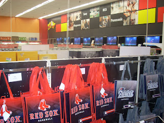
Books form a "half-wall" to corral the electronics section

Sunglasses too!

Local gear forms the "wall" that separates electronics from the checkout area.

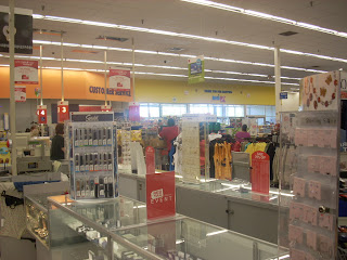
Looking at the front of the store from near Jewelry.


At home, at Kmart!


Looking back at the main entrance.
 A computer for job applications sits by the entrance.

Cashiers


The left side of the store.


The main entrance, looking to the right side. Note the Olan Mills and the merchandise cubby-area (where One Hour Photo used to be)

 Furniture

The rear aisle.

Shoes and layaway around the rear left corner.


Hey look, random Kenmore appliances!

The back right corner of the store.

One of the pantry aisles. There were also "Dollar Shop" areas to try to simulate/compete with stores like Dollar General, which are taking a small but growing chunk of sales from Kmart.

Too often, there are empty shelves at Kmart, and in fact, the food/pantry aisles are almost always guaranteed to have a section like this. Target has a new P-Fresh emphasis on fresh/frozen foods, with an expanded selection of perishables and consumables. Walmart, well obviously they have supercenters, and are even experimenting with foods in smaller non-super-sized stores. But Kmart... well, still no improvement on the food section. Foods are risky, though, as they expire, and have lower margins, so maybe Kmart is right not to take the risk.

Anyway, hope you enjoyed this Boston Big Kmart store tour, and until next time, work hard and help make our world a better place!